
Photography
Black-and-White Photography
Black-and-white photography is not merely colour removed. It reorganises the world through value, contrast, texture, and tonal relation. Without hue, the fall of light, material reflection, and separation of forms become newly explicit.
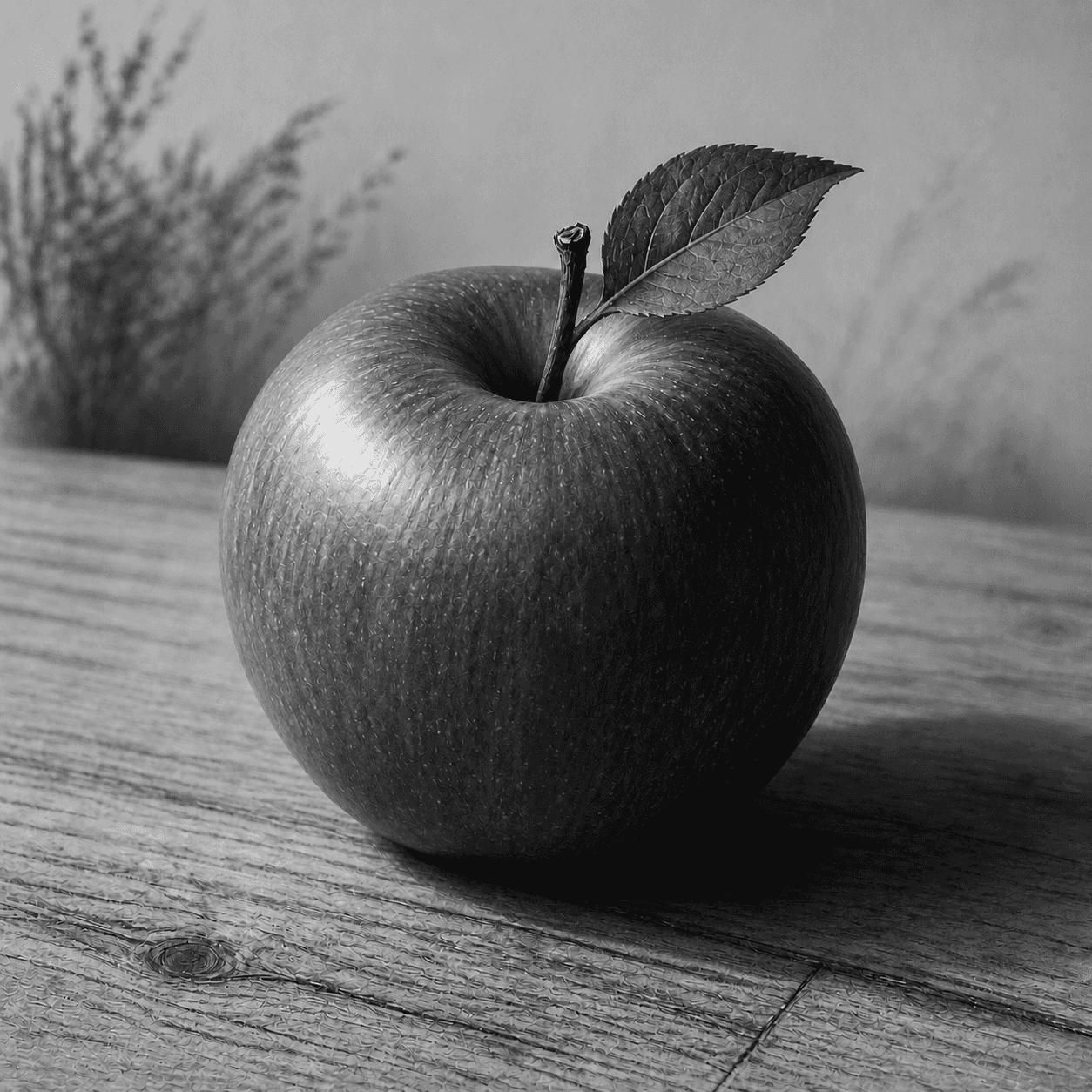
READ THE IMAGE
Do not search for a red apple; see how highlight, middle grey, and deep shadow give it weight
Colour has been translated into value. Upper-left light and middle tones turn the skin, the dark flank keeps separation, and veins distinguish leaf from background. Grey is not impoverished colour but another relational system.
- 01
Keep texture in the highlight
The brightest skin does not become blank paper; fine reflection and surface remain legible.
- 02
Let middle grey carry volume
A gradual middle passage from light into shadow makes a round body rather than a cut-out.
- 03
Differentiate the black end
Stem, shaded fruit, and cast shadow approach black at distinct densities and depths.
- 04
Translate colours deliberately
When red fruit, green leaf, and wood share value, filtration, lighting, or local contrast must separate them.
In one sentence
Set hue aside—
and rebuild vision on a scale from paper white to maximum black
Black-and-white photography records or outputs a monochrome image. In classic silver materials, development converts exposed silver halide into metallic-silver density; a digital workflow mixes colour channels into luminance. The image may begin on monochrome film, colour negative, or sensor. The creative work lies beyond a desaturate command—in light, filtration, exposure, development, local adjustment, and print.
VISUAL LANGUAGE
Tonal DNA
Scale
White through black
Contrast
Global and local
Global contrast sets force; local contrast reveals texture and separation.Light
Direction precedes colour
Side, back, or soft illumination directly shapes edge, surface, and space.Filter
Map colour into grey
Lens filters or digital channel mixes brighten some hues and darken others.Silver
Density and grain are material
Classic print blacks arise from reduced silver held in gelatin and may be chemically toned.Where it came from
Photography began largely monochrome; after colour, black and white became an intentional translation
Daguerreotype, calotype, and albumen print described the nineteenth century without natural colour. From the 1880s gelatin silver negative and paper became general standards across news, science, family, and art. Even after colour spread, monochrome persisted for tonal control, reproduction, and concentrated expression.
Early photography builds a monochrome record
Daguerreotype and paper negative preserve optical detail without reproducing object colour.
Gelatin silver becomes general
Dry plates, roll film, and developing papers simplify the twentieth-century workflow.
Modernist and documentary languages mature
Sharp structure, street instants, social surveys, and darkroom control enlarge monochrome practice.
Black and white becomes a chosen mapping
Film, sensor, or conversion still demand decisions about channel, contrast, and output.
ARTISTS & WORKS
Meet it through four photographers
Ansel Adams
Uses the Zone System to place anticipated values across negative and paper, demonstrating an expansive landscape scale.Dorothea Lange
Lets face, gesture, and environment carry dignity, labour, and institutional pressure in Depression-era grey.Walker Evans
Observes American building, object, and social surface through clear description and exact sequencing.Daido Moriyama
Turns high contrast, coarse grain, tilt, and blur into an unstable, forceful experience of the city.How to recognise it
Ask whether tone carries structure, not whether a colour file has simply been emptied
- ✓Do subject and ground separate through value, edge, or texture?
- ✓Are highlight and shadow intentionally allocated rather than both clipped?
- ✓After colour-to-grey conversion, do necessary relationships survive?
- ✓Can grain, contrast, and toning be related to a plausible process?
STYLE RELATIONS
Three neighbouring practices
Black-and-White Photography
Rebuilds light, form, and matter in monochrome, through film or digital means.CURRENTFilm Photography
Defined by photosensitive emulsion and chemistry; it may be monochrome or colour.↗Documentary Photography
Defined by real-world subject, context, and ethical responsibility; it need not be monochrome.↗REFERENCES
Sources & image note
The apple is a contemporary monochrome teaching example using long tonal scale, controlled blacks, and directional light. It is not a verifiable gelatin silver original; medium, conversion, and output would be needed for that claim.