
Internet Aesthetics
Frutiger Aero
Frutiger Aero imagines 2000s network technology as a bright, clean, nature-friendly public environment: glass buttons, drops, grass, and sky reassure new users.
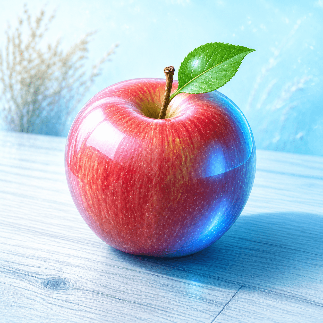
READ THE IMAGE
The apple seems placed in a webpage that breathes: transparent technology, bright air, and water and grass not kept outside the screen
Blue sky creates generous blank space; its body has bright core and soft edge like a glassy icon. Drops, leaf, and curve imply flowing connection. Nature is not ecological reporting here but an interface metaphor lowering technological unfamiliarity.
- 01
Read sky and whitespace
Bright blue, cloud, or rays make a soothing digital space.
- 02
Read glass layers
Window, button, or skin has transparency, reflection, and soft shadow.
- 03
Let nature serve UI
Grass, drop, fish, or leaf imply clean connection and flow rather than mere landscape.
- 04
Notice human absence
Many images use unpeopled naturalised space to make the network feel universal and calm.
In one sentence
Draw network and software as sky, water drops, and glass windows
so new technology feels natural, clean, and easy to enter
Frutiger Aero is a later umbrella term for common mid-to-late-2000s interface, advertising, and product imagery. It had no shared name at the time; ‘Frutiger’ recalls humanist typography and ‘Aero’ Windows Vista/7 glass language. Skeuomorphic highlight, rounded edge, nature photography, and bright blue-green make the internet a trustworthy daily space rather than an abstract system.
VISUAL LANGUAGE
Naturalised-network DNA
Sky
Open the UI with blue
Water
Flow means connection
Drop, bubble, and ripple imply light information movement.Glass
Window feels touchable
Transparency, bright rim, and soft shadow give functional areas depth.Life
Nature lowers distance
Grass, fish, leaf, and light package technology as healthy environment.Round
Interaction has soft edge
Rounded button and glowing icon make complex systems friendly.Where it came from
From Aqua and XP through Aero and Web 2.0 advertising, Frutiger Aero draws the internet as a naturalised public future
University of Waterloo’s Computer Museum dates it to 2004–2013 and connects the name to Frutiger type and Windows Aero. New-media research examines how this digital aesthetic enters physical space. It answers a moment when home internet needed explanation and reassurance, before flat UI displaced it.
Aqua and XP provide prehistory
Water-drop button, sky, and roundness move desktop away from grey office language.
Web 2.0 and Aero spread
Glass window, glossy icon, grass, and drop enter advertising and consumer products.
Flat turn
Windows 8 and mobile minimalism reduce skeuomorphic shine and transparent frame.
Internet nostalgia renames it
Communities gather dispersed memories as Frutiger Aero and question its conflict-free eco-tech dream.
ARTISTS & WORKS
Meet it through four cases
Mac OS X Aqua
Water-drop buttons, gel colour, and translucent layer offer an early friendly digital materiality.Windows XP Luna and Bliss
Sky, grass, and round controls make personal computing feel like easy nature.Windows Vista/7 Aero
Transparent glass window turns desktop hierarchy into visible space.Web 2.0 advertising graphics
Drop, globe, leaf, and glossy icon package network service as flowing ecology.How to recognise it
Test whether sky, nature, and glass UI together make technology feel gentle, transparent, and everywhere
- ✓Do natural elements imply clean connection or flow?
- ✓Do glass, bright rim, and roundness explain information hierarchy?
- ✓Do blue-green and white create reassurance?
- ✓Does it differ from Y2K hardware optimism by imagining a network environment?
STYLE RELATIONS
Three bright futures
REFERENCES
Sources & image note
The apple is a Frutiger Aero teaching interpretation using natural UI metaphors to explain 2000s network optimism; these signs are not evidence of real environmental performance.