
Graphic Design
Claymorphism
Icons and objects become bright, inflated, slightly hand-modelled 3D forms. The approach trades density for warmth and must control hierarchy and rendering cost.
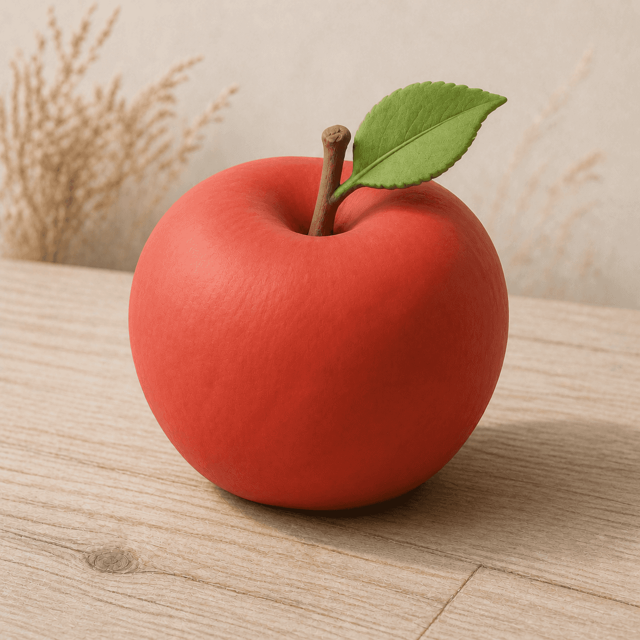
READ THE IMAGE
A soft material shaped like an apple, not a realistic fruit
Red is even, the contour is full, and leaf and stem resemble parts from one model kit. Natural detail recedes so volume and approachable colour carry the first impression.
- 01
Read the thick rounded contour
The apple has no sharp edge; transitions seem slowly pushed into shape by hand.
- 02
Read the matte colour field
Red is saturated without mirror gloss, suggesting clay, rubber, or soft plastic.
- 03
See details as components
Leaf and stem become recognisable modules; natural texture is only a quiet cue.
- 04
Ground it with a soft shadow
The shadow gives the object real spatial presence, but its diffuse edge avoids metal or hard plastic.
In one sentence
Digital 3D shaped like soft handmade matter—
making interface characters friendly and touchable
Claymorphism is a digital illustration and interface trend popularised in the early 2020s. It combines rounded geometry, soft volume, matte material, vivid colour, and broad shadows in 3D icons, avatars, feature art, and marketing images. It is not a digital version of ceramic history or actual clay craft; it borrows the idea of hand-shaped softness to build a playful, approachable personality.
VISUAL LANGUAGE
Soft-volume DNA
Volume
Thick, inflated
Surface
Matte, fine
Highlights are broad and soft, never glass-sharp.Colour
Vivid, sectional
Usually saturated with limited gradients, colours divide components.Shadow
Broad, soft, grounded
Cast shadow explains thickness and position while reinforcing tactility.Character
Friendly, toy-like
Rounded proportion and gentle exaggeration reduce seriousness.Where it came from
As 3D became easier to deliver, soft icons became a shortcut to brand warmth
Claymorphism inherits cartoon CG, toy design, soft-plastic rendering, and Neumorphism's gentle light. Real-time rendering, accessible 3D tools, and asset libraries lowered the barrier to consistent families of icons.
Rounded 3D icons and characters
CG advertising, operating-system icons, and animated films familiarise audiences with polished friendly objects.
Neumorphism restores softness
Paired shadows and large radii reopen interface discussion of material and touch, still mostly as low relief.
Claymorphism label spreads
Design communities distinguish full, candy-coloured 3D objects and soft shadows from monochrome Neumorphism.
Brand asset systems adopt it
Kits of icons and illustrations enter onboarding, empty states, and marketing, raising sameness, performance, and accessibility concerns.
ARTISTS & WORKS
Meet it through four kinds of practice
3D icon designers
Turn function symbols into thick rotatable objects with a consistent light and material library.Brand illustration teams
Use modular characters and objects to keep one voice across onboarding, errors, and marketing.Interaction animators
Use squash, rebound, and rotation so soft material behaves consistently with its appearance.Accessibility designers
Add contour, labels, and state marks so similar candy colours do not carry function alone.How to recognise it
Confirm soft volume, then ensure it does not bury information
- ✓Does the object have visible thickness, rounded expanding contours, and a matte surface?
- ✓Does colour separate components clearly rather than simulate complex realism?
- ✓Does shadow explain hierarchy instead of making every icon float without purpose?
- ✓When interactive, do icon, label, state, and focus maintain sufficient contrast?
STYLE RELATIONS
Three sources of softness
REFERENCES
Sources & image note
The apple demonstrates soft volume, matte colour, and a grounded shadow only. Claymorphism is not a formal platform standard; real use must be tested against hierarchy, colour, contrast, and performance guidance.