
Graphic Design
Neumorphism
Controls appear raised from or pressed into one soft material through paired light and dark shadows. The look is distinctive, but pushes contrast and state communication toward a dangerous limit.
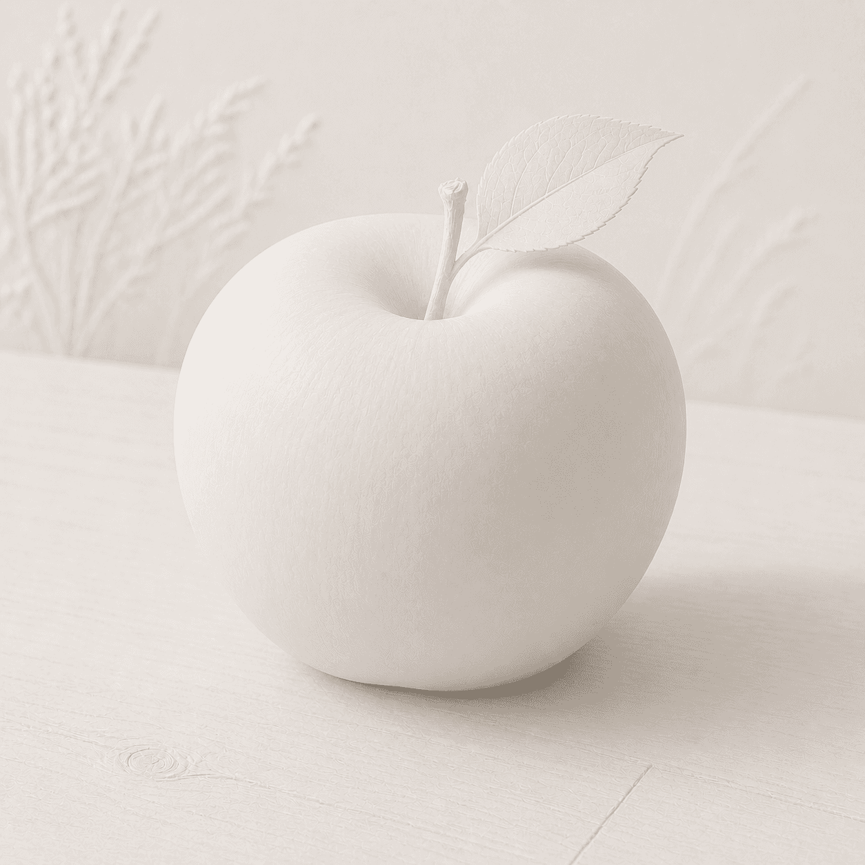
READ THE IMAGE
Subject and ground nearly share one colour, leaving form to light
A white apple slowly rises from a white table: light at upper left, shade at lower right, with no strong contour. This is both Neumorphism's appeal and risk—when the shadow disappears, so does the object.
- 01
Use one material
Apple, leaf, and environment share near-white colour, replacing sectional fills with continuity.
- 02
Pair the shadows
A light and a dark side jointly create relief; one cast shadow would read as an ordinary card.
- 03
Switch convex and concave
The fruit cavity presses inward while the contour bulges out, suggesting inset and outset control states.
- 04
Test low-vision conditions
Lower the display brightness or squint: leaf and edge vanish quickly, so subtle shadow cannot carry interaction alone.
In one sentence
Imagine the interface as one soft material—
controls extruded from or pressed into its surface
Neumorphism is an interface surface trend spread through design communities around 2019, its name blending new and skeuomorphism. Cards and buttons usually share the background colour; a pale upper-left highlight and darker lower-right shadow create low relief. It reintroduces tactility without imitating the specific leather, metal, or tools of traditional skeuomorphism.
VISUAL LANGUAGE
Low-relief DNA
Ground
Monochrome, continuous
Light
Fixed, diagonal
Paired light and dark soft shadows follow one direction.Form
Rounded, shallow
Large radii and low height avoid a hard mechanical feel.State
Outset and inset
Outer shadows suggest rest; inner shadows suggest pressed or selected.Contrast
Deliberately restrained
The aesthetic depends on small differences, so border, colour, or icon must protect recognition.Where it came from
After flat UI, design communities searched again for touchable surfaces
Neumorphism is not a complete industrial design movement but a visual trend amplified by concept shots and front-end experiments. It mixes flat design's quiet ground, Material-era shadows, and skeuomorphic tactility.
Flat cards become normal
Solid colour, radius, and shadow separate components, providing a visual grammar Neumorphism can reuse.
Low-relief concepts go viral
Alexander Plyuto and others publish same-colour paired-shadow controls that draw concentrated attention.
The name spreads
Tutorials, generators, and portfolio shots rapidly reproduce soft buttons, music players, and dashboards.
Accessibility critique and selective use
Low contrast, unclear states, and dark-mode problems prevent it becoming a universal system; it survives in decorative or noncritical roles.
ARTISTS & WORKS
Meet it through four key roles
Alexander Plyuto
His monochrome low-relief UI concept became the trend's most frequently cited visual trigger.Tutorial community
Turned the paired-shadow recipe into CSS, design presets, and generators for rapid copying.W3C WAI
Non-text contrast guidance explains why control boundaries and states cannot rely on nearly invisible shadows.Platform design teams
Contours, elevation, state colour, and standard controls show that shadow should carry information, not tactility alone.How to recognise it
Confirm same-colour paired shadows, then test discoverability
- ✓Do controls and ground share essentially one colour and soft material idea?
- ✓Do light and dark shadows appear as a consistent pair?
- ✓Do pressed, selected, disabled, and keyboard-focus states have explicit non-shadow cues?
- ✓Do control boundaries and key symbols meet sufficient non-text contrast?
STYLE RELATIONS
Three sources of depth
REFERENCES
Sources & image note
The apple intentionally suppresses contrast to show monochrome low relief and expose its recognition risk. Real products must prioritise visible controls, states, focus, and text.