
Graphic Design
Skeuomorphism
Digital objects borrow the appearance, sound, or behaviour of physical things so unfamiliar actions connect to prior experience. The question is not realism itself, but whether the metaphor still works.
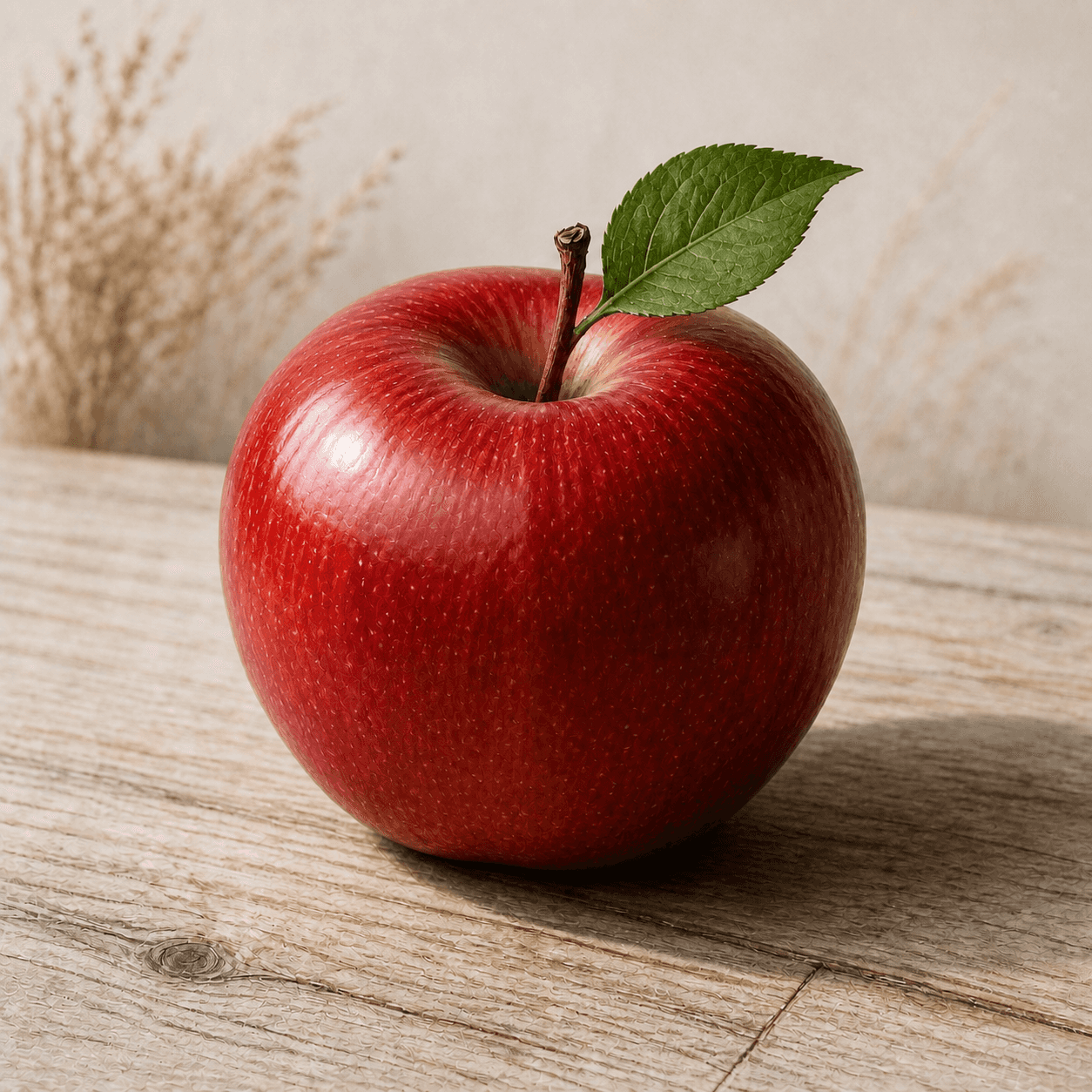
READ THE IMAGE
Realism is not the goal; familiar causality is the clue
Skin pores, veins, wood, and directional shadow make the object feel touchable. In an interface those cues matter only when they communicate use, state, or action; a realistic rendering alone does not create usability.
- 01
Infer the material
Gloss and microtexture invite a prediction that the skin is smooth with slight resistance.
- 02
Let light establish objects
Highlight, occlusion, and cast shadow jointly explain volume, front and back, and contact.
- 03
Trigger memory with familiar things
Leaf, stem, and timber place the image in everyday experience, reducing the need for labels.
- 04
Ask whether the metaphor operates
If this were a button, pressed, hover, and disabled states should behave as one coherent object, not a static skin.
In one sentence
Keeping an old object's form in a new medium—
using familiarity to explain new function
A skeuomorph originally meant a feature retained from an older material or technology after it ceased to be structurally necessary. In digital interfaces it appears as folders, wastebaskets, page turns, shutter sounds, leather calendars, and glossy buttons. It can imitate appearance, behaviour, or sound; its useful purpose is to reduce learning cost, not to disguise a screen as a photograph.
VISUAL LANGUAGE
Metaphor DNA
Material
Tactile, inferable
Light
Volumetric, consistent
Highlight, recess, and shadow create pressable or graspable relations.Object
Borrowed from familiar life
Files, tools, containers, and desktops make abstract data intelligible.Behaviour
Faithful to the metaphor
Pages, knobs, and sliders should respond consistently with their appearance.Sound
Confirms causality
Shutter, paper, or mechanical return can confirm action without obstructing use.Where it came from
At every media transition, old forms have helped explain new technologies
Skeuomorphism predates smartphones: pottery copied basket weave and electric lamps copied candlesticks. Graphical interfaces turned the office and desktop into a cognitive bridge for manipulating data.
Desktop metaphors reach personal computers
Xerox Star, Apple Lisa, and Macintosh turn commands into direct manipulation through documents, folders, bins, and windows.
Controls gain digital objecthood
Buttons, scrollbars, tabs, and toolbars use edge and shadow to suggest clicking, dragging, and hierarchy.
Touchscreen skeuomorphism peaks
Early iPhone apps use leather, paper, wood shelves, and mechanical controls to give a new touchscreen familiarity and character.
iOS 7 marks a public turn
Physical texture is muted in favour of clarity, content, and layers; realism shifts toward motion rather than surface decoration.
ARTISTS & WORKS
Meet it through four interface moments
Xerox Star team
Organised desktop, folders, and documents into a coherent office metaphor.Susan Kare
Drew approachable Macintosh icons so disks, bins, and tools read at low resolution.Bas Ording
Used inertia and rubber-band return to give touchscreen scrolling physical causality.Apple iOS team
Pushed paper, leather, and felt into strong application identities across Notes, Calendar, and Game Center.How to recognise it
Test whether real-world cues explain digital behaviour
- ✓Does the interface borrow a clearly nameable physical object or material?
- ✓Do shadow, texture, and sound communicate purpose, state, or operation?
- ✓Does interaction honour the visual metaphor rather than applying a decorative skin?
- ✓Is the metaphor still understood and adaptable across size, language, and accessibility needs?
STYLE RELATIONS
Three degrees of borrowing reality
REFERENCES
Sources & image note
The apple demonstrates realistic material and physical light, not an interactive interface. Skeuomorphic design must also be judged through control states, feedback, learning cost, and accessibility.