
Graphic Design
Flat Design
Set aside simulated leather, glass, and metal; organise the interface with colour, type, icons, and hierarchy. Good flat design must still show what can be understood and touched.
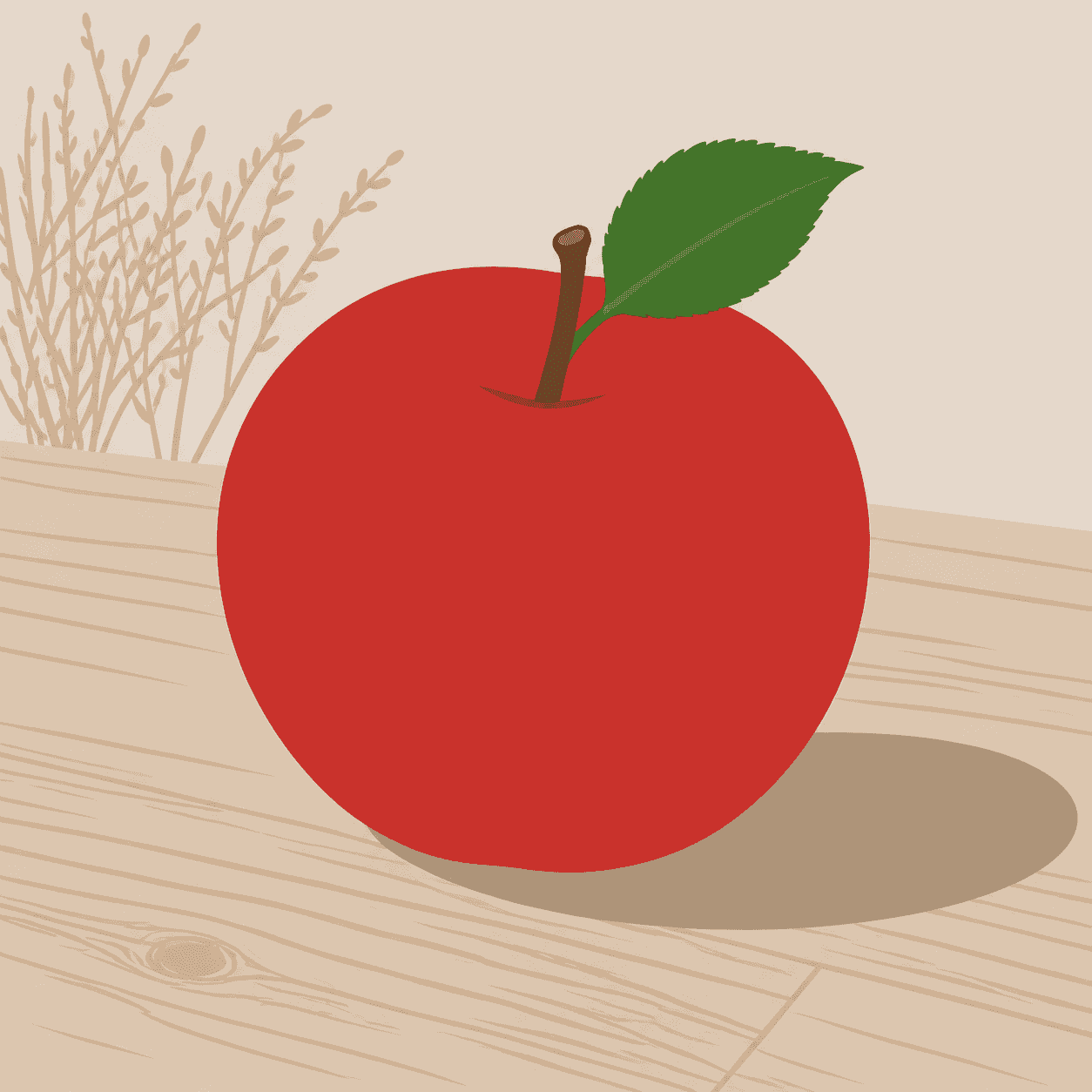
READ THE IMAGE
Notice what disappears—and what restores the information
The apple no longer depends on leather grain, glossy highlights, or realistic volume. Solid fields and contour support recognition, while one restrained shadow still anchors the object. Flat does not mean erasing every depth cue.
- 01
Read continuous fields
Red behaves largely as one plane; colour differences separate regions rather than imitate complex material.
- 02
Let silhouette precede texture
Apple, leaf, and stem are recognised immediately from shape without a realistic skin.
- 03
See detail as selection
Veins, wood grain, and plants are compressed into a few lines and blocks; information is edited, not absent.
- 04
Keep functional depth
A broad simple shadow locates the apple on the table. Necessary hierarchy may remain without illusionism.
In one sentence
Not flattening everything into 2D—
but organising information by digital rules
Flat design replaces skeuomorphic material imitation with clear typography, icons, solid colour, grids, and simplified shapes. Its precedents include modernist graphics, public pictograms, and vector imagery. Around 2010, Microsoft's Metro put content, type, and motion ahead of decoration; iOS 7 brought de-skeuomorphism into mass mobile use. It is not one brand look but a shift in whether digital interfaces should pretend to be physical objects.
VISUAL LANGUAGE
Interface DNA
Shape
Geometric, simplified
Colour
Solid, sectional
Fields distinguish hierarchy, state, and brand rather than imitate material.Type
Content first
Scale, weight, and spacing carry navigation and information order.Icons
Systematic, scalable
Limited strokes remain consistent and legible across sizes.Motion
Explains change
Transitions and feedback restore causality and spatial relation missing from a still plane.Where it came from
From modernist graphic language to touchscreen de-skeuomorphism
Flat design did not arrive as an isolated visual trend. It carried the simplifying methods of Swiss graphics, public signage, and early digital icons into products spanning screens, sizes, and touch input.
Modern information systems
Grid, sans serif type, standard pictograms, and high-contrast colour establish foundations for cross-media clarity.
Metro takes shape
Zune and Windows Phone favour typography, content blocks, vivid colour, and directional motion over simulated controls.
Flat becomes mainstream
Windows 8 expands Metro; iOS 7 removes much leather, felt, and gloss from mass mobile interfaces.
Material restores governed depth
Google uses paper metaphor, light, and motion to distinguish hierarchy, responding to discoverability problems in purely flat UI.
ARTISTS & WORKS
Meet it through four systems
Microsoft Metro team
Large type, content tiles, and directional motion construct digitally native navigation.Apple design team
iOS 7 removes extensive simulated material and rebuilds familiar controls through layers, colour, and motion.Google Material team
Surfaces, light, components, and motion rules return operational depth to flat geometry.Otl Aicher
Earlier showed how consistent pictograms, grids, and limited forms could systematise complex public information.How to recognise it
Read the hierarchy before checking for realistic decoration
- ✓Can shapes and icons be recognised without convincing texture?
- ✓Do colour, type scale, and spacing distinguish hierarchy and state?
- ✓Do buttons, links, and selections remain discoverable?
- ✓Do motion and feedback explain results instead of merely decorating transitions?
STYLE RELATIONS
Three spatial models for digital interfaces
REFERENCES
Sources & image note
The apple is a contemporary teaching interpretation showing simplified contour, colour fields, and a functional shadow. Real flat interfaces must be tested through interaction, state, responsive layout, and accessibility.