
Graphic Design
Glassmorphism
Translucency, backdrop blur, bright edging, and layers make an interface resemble frosted glass above content. Its job is to preserve context, not turn every card transparent.
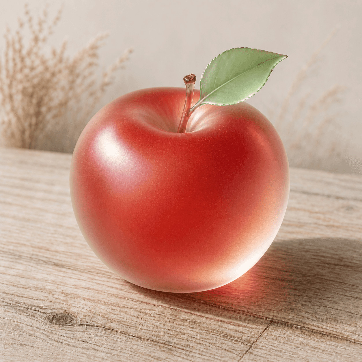
READ THE IMAGE
Glass comes from a front–back relationship, not reduced opacity
The apple's edge glows, interior colour softens, and the setting remains faintly visible. An interface material also needs blur, tint, and contrast control so foreground and background remain related without competing.
- 01
Diffuse the background
The environment does not remain sharply visible through the apple; it spreads into colour and light.
- 02
Define the sheet with edges
A bright contour and local reflections separate the translucent surface from its setting.
- 03
Mix colour across layers
Apple red combines with the beige behind it instead of acting as a single low-opacity fill.
- 04
Protect legibility
Content on this surface would need tint, scrim, or a thicker material to stabilise contrast.
In one sentence
Let the background pass through a controlled material—
while establishing foreground hierarchy and focus
Glassmorphism is a popular label for translucent interface materials typically combining backdrop blur, translucent fill, light edge, soft shadow, and a colourful ground. It is not one company's formal system: Windows Fluent calls one version Acrylic, while Apple platforms use materials of different thickness. Effective use supports depth, contextual continuity, and transient surfaces instead of applying frosted cards everywhere.
VISUAL LANGUAGE
Material DNA
Transparency
Controlled, not clear
Blur
Diffuses what is behind
A spatial filter turns underlying content into low-frequency colour.Edge
Light, reflective
Fine strokes and highlights define the boundary of a glass sheet.Layer
Foreground floats
Shadow, occlusion, and scrolling reveal which plane is interactive.Adaptation
Environment aware
Light/dark modes, backdrop colour, and reduced transparency require alternatives.Where it came from
From transparent desktop windows to system materials and a mobile design trend
Transparent windows predate the glassmorphism label. System design gradually moved from spectacular glass toward semantic material, where blur and opacity correspond to navigation, transient UI, and content layers.
Aero Glass enters the desktop
Windows Vista uses translucent borders, blur, and reflection to emphasise overlapping windows and hardware capability.
iOS 7 expands translucent layers
Control Center, bars, and blur retain awareness of content below while shifting from literal texture toward light and depth.
Fluent systematises Acrylic
Microsoft combines translucency, blur, noise, tint, and blend mode into a material with explicit usage limits.
Glassmorphism becomes a popular label
Large radii, colourful grounds, and frosted cards spread through design media, exposing contrast, performance, and over-layering problems.
ARTISTS & WORKS
Meet it through four systems
Windows Aero
Brought translucent, blurred window frames to mass desktop computing and emphasised overlap.Apple iOS team
Used system blur and translucent bars to maintain navigation above content.Microsoft Fluent team
Defined Acrylic as an adaptive recipe of backdrop, blur, blend, tint, and noise.Apple platform design team
Uses system materials of semantic thickness to separate background, content, and controls.How to recognise it
Test whether the material actually builds hierarchy
- ✓Does background colour pass through while detail is properly blurred?
- ✓Does the transparent plane serve navigation, transient UI, or another clear foreground role?
- ✓Do text and controls retain contrast over the brightest and darkest possible backdrops?
- ✓Is there a robust opaque fallback for reduced transparency, battery, or low-end modes?
STYLE RELATIONS
Three soft interface surfaces
Glassmorphism
Allows a blurred background through foreground material to stress layered depth.CURRENTNeumorphism
Uses paired same-colour shadows for controls extruded from or pressed into a ground.↗Liquid Glass
Uses more dynamic refraction, deformation, and environmental adaptation for a system control layer.↗REFERENCES
Sources & image note
The apple emphasises translucency, background diffusion, and edge reflection as a material study. Real interfaces must test varied backdrops, motion, contrast settings, performance, and opaque fallback.