
Graphic Design
Memphis
When modernism turned good design into solemn rules, Memphis reopened choice with laminate, loud colour, jokes, and unstable furniture.
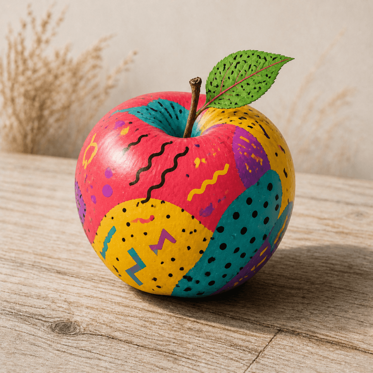
READ THE IMAGE
The patterns deliberately refuse to obey the apple's natural surface
Dots, squiggles, zigzags, and clashing fields sit on the round fruit like cheap laminate. That conflict is the cue: Memphis made surface, sign, and mood openly challenge restrained modernist taste.
- 01
See patterns disagree
Dots, dashes, waves, and fragments coexist without stylistic unity, producing intentional visual noise.
- 02
Read unnatural colour
Pink, yellow, teal, and violet cover fruit and leaf with the palette of commercial imagery rather than observed light.
- 03
Treat surface as laminate
Graphics appear applied, recalling how plastic laminate brought supposedly low material into elite design.
- 04
Ask how wit changes use
A joke can recast an object's identity, while historical Memphis furniture still negotiates real structure and use.
In one sentence
Not random 1980s pattern—
but using bad taste to ask who defined good design
Memphis was a loose Milan collective formed in 1980 by Ettore Sottsass and younger international designers, debuting furniture, lighting, ceramic, glass, and textile in 1981. Against solemn functionalism and timelessness, it mixed Art Deco, Pop, suburban commercial patterns, historical quotation, and bright laminate. Expensive, finely made objects used visual codes associated with cheap culture; that contradiction gave the critique force.
VISUAL LANGUAGE
Rule-breaking DNA
Colour
Bright, clashing
Pattern
Dots, squiggles, confetti
Surface graphics cooperate with and sabotage structure.Material
Laminate, glass, metal
Everyday industrial surfaces appear proudly instead of imitating fine wood.Form
Totemic, characterful, unstable
Furniture can resemble robot, animal, or stage prop.Attitude
Ironic, temporary, mediated
Design admits fashion, consumption, and emotion instead of timeless neutrality.Where it came from
A media explosion after Italian Radical Design
1960s–70s Anti-Design, Archizoom, Superstudio, and Studio Alchimia had challenged consumer society and modernism. Memphis turned those arguments into brighter, more commercial, and more reproducible objects.
Radical Design prepares the ground
Italian groups use theory, exhibitions, and anti-functional objects to challenge the modern home.
Meeting at Sottsass's home
Designers decide to launch new work together without submitting to one manifesto.
Milan debut
Crowds enter Arc ’74 as Carlton, Super, and other objects become international media images.
Founder departs and group closes
The group continues briefly after Sottsass leaves; its pattern language becomes widely commercialised.
ARTISTS & WORKS
Meet it through four members
Ettore Sottsass
United the group's concepts and image through totemic furniture, laminate, and cultural collage.Nathalie Du Pasquier
Built Memphis's most recognisable vocabulary through dense textile and surface patterns.Martine Bedin
Turned a lamp into a wheeled luminous dog, giving technology character and wit.Peter Shire
Brought California popular culture and asymmetric sculpture into ceramic and furniture.How to recognise it
Look for deliberate conflict of taste
- ✓Do colour and pattern deliberately interrupt unity of material and structure?
- ✓Does ordinary material such as laminate become a visual protagonist?
- ✓Does form hover among function, sculpture, furniture, and character?
- ✓Is it linked to the 1981 Memphis group or a clear influence rather than generic eighties nostalgia?
STYLE RELATIONS
Scales of anti-modernist design
Anti-Design
Attacks consumption and functionalism through critical objects and utopian projects in 1960s–70s Italy.↗Memphis
Turns satire into vivid material through saleable furniture, pattern, and media spectacle.CURRENTPostmodern Design
More broadly restores quotation, sign, place, and ambiguity against a single modernism.↗REFERENCES
Sources & image note
The apple shows Memphis's most transmissible surface language only. Furniture structure, material class, Italian Radical Design, and 1980s consumer media remain necessary context.