
Graphic Design
Postmodern Design
When one universal, rational story of modern progress lost credibility, design recalled history, place, sign, humour, and contradiction.
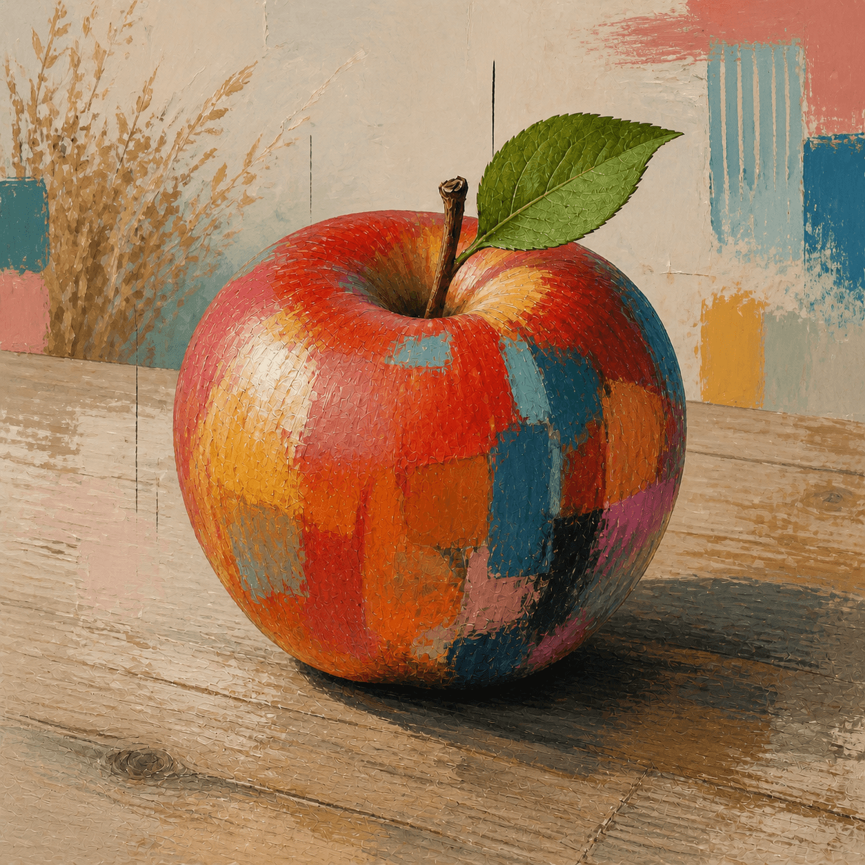
READ THE IMAGE
The apple stays whole while its surface speaks several design languages
Rough marks, colour blocks, grid fragments, and classical calm overlap. They cue quotation, collage, and plurality—not a fixed palette or permission for arbitrary mixing.
- 01
Let fragments coexist
Warm patches, cool stripes, and black lines keep different voices instead of merging into one system.
- 02
See surface admit disguise
Overpainting, erasure, and distress openly present surface as designed and quoted.
- 03
Watch order get interrupted
A geometric grid appears but is cut by gesture, object, and blankness; reason no longer has the final word.
- 04
Look for a second meaning
Postmodern signs often joke, cite history, or comment on consumption beyond use.
In one sentence
Not an anything-goes style mix—
but refusing one correct version of modernity
Postmodern design names multiple responses to modernist universality, purity, and linear progress. From 1960s architectural theory and Radical Design onward, practitioners restored historical elements, local signs, ornament, bright colour, metaphor, and popular culture. Quotation, parody, and irony exposed style's authority. The field contains contradictory practices and cannot be represented by Memphis alone.
VISUAL LANGUAGE
Attitude DNA
Quotation
History meets popular culture
Complexity
Contradiction over purity
Use, symbol, ornament, and context need not submit to one answer.Sign
Objects communicate
Form conveys identity, place, memory, and irony.Surface
Fake, collage, distress
Truth is no longer defined only by structural and material honesty.Media
Design meets popular culture
Architecture, furniture, magazine, music video, and fashion circulate together.Where it came from
From architectural critique to the 1980s consumer spectacle
As postwar Modernism became institutional orthodoxy, architects and Radical Design questioned its neglect of history, place, and popular meaning. Oil crisis, punk, new media, and booming markets then entangled criticism with commerce.
Complexity and Contradiction in Architecture
Robert Venturi defends hybridity, convention, and multiple readings.
Learning from Las Vegas
Commercial signs and ordinary buildings become a communication system worthy of study.
The Presence of the Past
The Venice Architecture Biennale presents historical quotation as an international turn.
Subversion becomes the designer decade
Memphis, magazines, music video, and corporate consumption globalise postmodern languages.
ARTISTS & WORKS
Meet it through four practitioners
Robert Venturi & Denise Scott Brown
Read the commercial strip to rethink architectural sign, convention, and public understanding.Michael Graves
Returned image and metaphor through exaggerated colour and historical elements in buildings and goods.Ettore Sottsass
Put laminate, totem, bad taste, and commodity contradiction at the media centre through Memphis.April Greiman
Used early digital tools, photography, and spatial layering to break the Swiss graphic grid.How to recognise it
Find relations of quotation, not bright mixing alone
- ✓Are there legible references to history, place, or popular culture?
- ✓Do ornament and sign carry meaning rather than added noise?
- ✓Does irony, collage, or contradiction challenge modernist norms?
- ✓Can the work's specific context be named rather than calling all complexity postmodern?
STYLE RELATIONS
From one group to a broad attitude
REFERENCES
Sources & image note
The apple uses fragments, distress, and a broken grid to cue postmodern collage, only one face of a broad attitude. Medium, context, source of quotation, and design debate remain essential.