
Islamic Art
Arabic Calligraphy
Arabic calligraphy is not unfamiliar letters bent into luxurious pattern. It begins as readable language, then becomes visual art through broad-edge reed-pen modulation, letter proportion, joining rhythm, and line structure; Qur'anic text, poetry, benediction, and signature change how a work should be seen.
READ THE IMAGE
Judge how strokes begin, join, and form hierarchy before asking whether they resemble abstract ornament
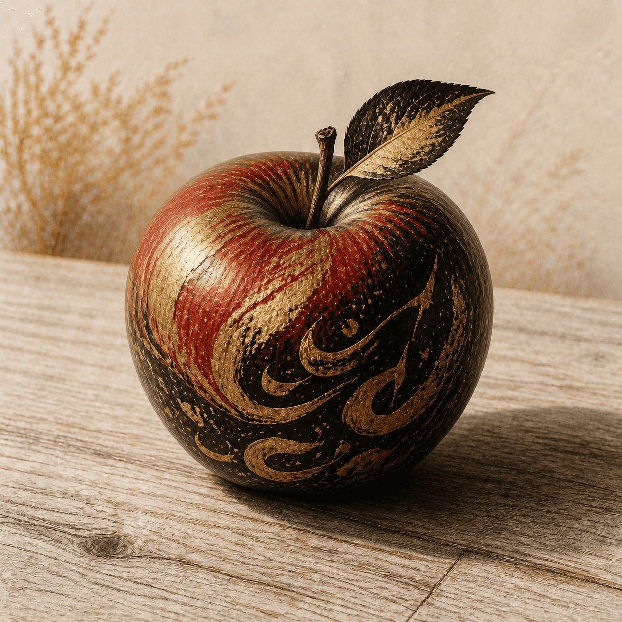
Gold sweeping strokes and red-gold fields cross a lacquer-like black apple, suggesting metalwork and painted calligraphy. No complete text can be securely read, so the image is not an actual calligraphic work.
- 01
See the broad nib make modulation
A gold main stroke shifts from wide to narrow as though an angled reed pen touches and lifts. True modulation follows nib direction rather than arbitrary outline.
- 02
See baseline oppose extension
Long lower curves travel across the round surface while shorter upper forms gather toward the stem. Calligraphy stabilises reading with horizontal joins, then changes tempo with verticals and tails.
- 03
See whether word or ground speaks first
Gold advances against black while red-gold passages approach ornament. Strong work lets decoration reinforce textual hierarchy instead of erasing meaning.
- 04
See curvature test connection
Edge strokes compress while front-facing arcs stay clear. Architectural, ceramic, and metal inscriptions must redesign joining for boundary, seam, and viewing distance.
In one sentence
Not Arabic letters treated as decorative signs—
but readable language, pen proportion, rhythm, and support composed together
Arabic calligraphy builds on a joined alphabet whose letters change form according to position in a word. A calligrapher cuts a reed pen and uses rhombic dots made by the nib to measure height, bowl, counter, and interval, arranging pause, extension, overlap, and embellishment within rules. The Qur'an gives exact and beautiful transmission special standing, but calligraphy is not only religious: poems, royal praise, aphorisms, blessings, place names, and signatures cross pages, buildings, ceramics, metal, textile, and carpet. ‘Arabic calligraphy’ must also separate language from script: Persian, Ottoman Turkish, and Urdu use adapted Arabic letters yet sustain their own literary and scribal traditions.
VISUAL LANGUAGE
Visual DNA
Nib
An angled reed pen creates thick and thin
Proportion
Dot and circle organise scale
Classical systems measure vertical, bowl, counter, and line spacing in nib-width dots so a script keeps character across sizes.Joining
The baseline conducts reading rhythm
Most letters connect; extension, return, and break must serve spelling, word division, and composition together.Hierarchy
Script, scale, and colour assign voices
Monumental thuluth may title while clear naskh carries text, and gold, black, and coloured signs distinguish verse, heading, and recitation mark.Support
Material translates handwriting
Soft paper strokes become incision, relief, glaze, inlay, weave, or structural inscription when they move to stone, ceramic, metal, textile, and brick.Where it came from
From early Arabic writing and Qur'an copying through proportional scripts to regional schools, print, and contemporary letter art
Script names are not a static font menu: the same label changes across periods and works mix scripts. Teaching lineages, pen cutting, paper, and patron institutions shape style as much as letterform charts do.
Qur'an copying develops solemn hands and page architecture
Early parchment Qur'ans often use broad horizontal formats and angular writing later grouped as Kufic; dots, vowels, and gold verse devices increasingly aid recitation.
Proportional cursive is systematised
Tradition associates Ibn Muqla with dot-and-circle proportion; Ibn al-Bawwab and Yaqut al-Musta'simi refine naskh, thuluth, and the six pens into models.
Iranian, Ottoman, and South Asian systems diverge
Nasta'liq adapts falling lines to Persian poetry, while Şeyh Hamdullah and Hafiz Osman reshape Ottoman Qur'ans, specimens, and hilye layouts.
Print, nation, and digital media alter the letter
Mechanical type struggles with joining before modern fonts rebuild the system; Hurufiyya and later artists make language, identity, and abstraction newly tense.
ARTISTS & WORKS
Meet text, proportion, and material through four works
Folio from the Blue Qur'an
Gold angular letters on deep indigo parchment establish solemn rhythm through wide spacing and sparse signs; luxury material intensifies ritual viewing without replacing reading.Ibn al-Bawwab, signed Qur'an
Small lucid rounded script, proportional letters, and integrated illumination mark a new paper Qur'an phase in one of the rare complete signed medieval manuscripts.Folio from the Baysunghur Qur'an
Enormous muhaqqaq crosses a giant sheet with tall verticals and expansive horizontals, giving writing architectural scale for public recitation and dynastic prestige.Hafiz Osman, hilye panel
A central description of the Prophet, roundel, Qur'anic band, and signature form a hangable composition that organises reverence and memory without portraiture.How to recognise it
Verify text, script, nib, proportion, and support together—not merely curling gold lines
- ✓Can the wording, language, and purpose be read or documented: Qur'an, poem, blessing, maxim, title, or pseudo-Arabic ornament?
- ✓Does modulation follow a consistent broad nib, and do counters, verticals, and tails support a recognisable script proportion?
- ✓Do joins, breaks, dots, and vowel signs preserve spelling and reading, or were they freely altered for pattern?
- ✓How does writing meet page, roundel, dome, vessel, or textile edge, and does the material preserve or translate pen action?
STYLE RELATIONS
Written structure, geometric repeat, and Latin typographic grid require different reading mechanisms
Arabic Calligraphy
Uses joined writing, broad-nib modulation, dot proportion, and textual meaning to structure page and material surface.CURRENTIslamic Geometry
Uses grid, symmetry, stars, polygons, and material seams for repetition rather than linguistic legibility.↗Swiss International
Uses modern sans serif type, modular grid, and information hierarchy for print and public communication in another script and institution.↗REFERENCES
Sources & image note
Black reserve, gold sweep, clustered strokes, and red-gold layering give the apple a luxurious calligraphic surface, but its marks do not form a verified continuous text or documented script lineage. It is a teaching image for nib movement and curved support only.