
Graphic Design
Swiss Style
Making information as clear as a public system: grid, sans serif type, objective image, and asymmetric layout serve reading together.
READ THE IMAGE
The image feels quiet because its order sits in an invisible grid
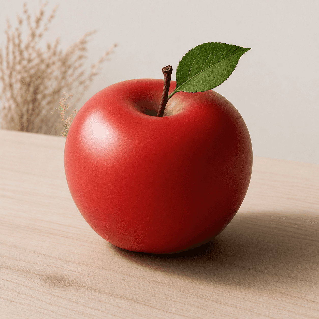
This teaching image avoids decoration and builds hierarchy through a clear subject, ample space, an offset background, and precise light. Full Swiss Style also requires type and layout; the photograph cues only one layer.
- 01
Read the objective subject
The apple is shown clearly, almost like product photography, without an illustrative manner obscuring form or surface.
- 02
Find asymmetric balance
The fruit sits right of centre while plant and shadow pull across the field; balance is not mirror symmetry.
- 03
Use whitespace functionally
The pale ground creates breathing room and an information zone. Empty space is structure, not vacancy.
- 04
Imagine type on the grid
Heading, caption, and number could enter along left edges and horizontal baselines with consistent hierarchy.
In one sentence
Not making everything cold—
but organising complex information into a repeatable system
Swiss Style, or the International Typographic Style, matured in Zurich and Basel in the 1950s. Modular grids, sans serif type, flush-left ragged-right setting, objective photography, and strong hierarchy organised posters, publications, and public information. It developed rational methods from New Typography, Constructivism, and Bauhaus within postwar professional and multilingual communication.
VISUAL LANGUAGE
Layout DNA
Grid
Invisible, modular
Type
Sans serif, hierarchical
Size, weight, and spacing carry structure without applied ornament.Alignment
Flush left, ragged right
A stable edge speeds scanning while preserving natural word spacing.Image
Photography, diagram, fact
Pictures often act as evidence or information rather than lyrical backdrop.Composition
Asymmetric, exact
Tension comes from proportion and placement instead of central symmetry.Where it came from
From avant-garde typography to postwar public systems
New Typography, Constructivism, and Bauhaus had already advanced asymmetry, photography, and functional type between the wars. Swiss schools, printers, and international institutions refined those methods after 1945 and distributed them through journals, posters, and identities.
New Typography sets precedents
Jan Tschichold and others codify asymmetry, standardisation, and photographic type from avant-garde experiment.
Zurich and Basel mature the language
Josef Müller-Brockmann, Armin Hofmann, and peers develop grid discipline through teaching and cultural posters.
Helvetica is released
Neue Haas Grotesk appears from Haas Type Foundry and later becomes an international sans serif emblem.
Neue Grafik travels
A multilingual journal presents Swiss practice as a system for international professional communication.
ARTISTS & WORKS
Meet it through four designers
Josef Müller-Brockmann
Organised concert and public posters with mathematical grids, photography, and acoustic rhythm.Armin Hofmann
Built tension from black-white contrast, type, and photography while teaching in Basel.Emil Ruder
Grounded typographic teaching in space, rhythm, contrast, and the function of reading.Max Bill
Linked Concrete art, Ulm teaching, and systemic design through proportion and function.How to recognise it
Look for a reusable information system
- ✓Do columns, margins, baselines, and alignments repeat consistently?
- ✓Is hierarchy built mainly through size, weight, and space rather than ornament?
- ✓Does photography or diagram carry factual information instead of mood alone?
- ✓Is the asymmetric layout still exact, stable, and quick to scan?
STYLE RELATIONS
Three contexts for rational design
Bauhaus
Uses school, foundation course, and workshops to connect art, material, industry, and life.↗Swiss Style
Uses grid, type, and objective image to organise postwar public and corporate information.CURRENTMinimal Design
Reduces elements to lower visual load but need not employ a rigorous information grid.↗REFERENCES
Sources & image note
The apple only simulates objective photography, whitespace, and asymmetric balance. Without actual text it cannot fully demonstrate typographic hierarchy or a modular grid, so the image is an entry into the layout method.