
Graphic Design
Minimal Design
Reduction is not leaving a page empty. It is deliberate choice so use, hierarchy, material, and operation can be understood with less interference.
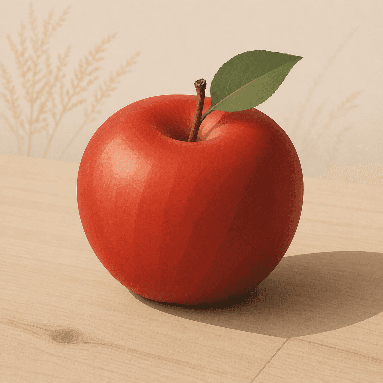
READ THE IMAGE
Few elements remain, so every one must work
Apple, leaf, table, pale ground, and one shadow form a quiet hierarchy. If removal damages understanding or use, the result is no longer good minimal design.
- 01
Confirm one protagonist
The apple holds the strongest colour and largest area while other elements recede.
- 02
Make space organise
The empty ground separates and stabilises the subject; it is not waste used to signal luxury.
- 03
Keep detail sufficient
Leaf, stem, highlight, and shadow are just enough to explain material, direction, and position.
- 04
Imagine real operation
Reduction in products and interfaces must clarify function; hiding necessary controls merely transfers complexity to users.
In one sentence
Not the less, the more premium—
but only what supports understanding and use
Minimal design is a broad cross-media method inheriting modernist function, proportion, grid, material honesty, and industrial production. Postwar Ulm and Braun advanced systems and legibility in consumer products; Dieter Rams later framed the ethic as ‘less, but better.’ It is neither a fixed white aesthetic nor identical to 1960s Minimal art.
VISUAL LANGUAGE
Editing DNA
Hierarchy
Singular, clear
Form
Basic, proportioned
Simple contours depend on exact proportion, not lack of care.Function
Visible, understandable
Control, feedback, and purpose require little explanation.Material
Honest, durable
Structure and touch avoid needless disguise and support long use.System
Consistent, extensible
Grid, module, and rule bring order to complex product families.Where it came from
From modernist reform to consumer electronics and digital interfaces
Bauhaus, New Typography, and International Style established functional form. Ulm joined design to science and systems; Braun built a restrained language through corporate teamwork. Later tech brands inherited the look, creating tension between restraint and premium consumption.
Modernism forms a functional language
Bauhaus and New Typography reorganise object and information through geometry, standardisation, and reduced ornament.
Ulm School of Design
Method, semiotics, and industrial partnership move design from personal style toward systems.
Braun's design system matures
Rams, Hans Gugelot, and teams unify products through clear controls, modules, and quiet enclosures.
Ten principles of good design
Facing a confusion of objects and noise, Rams links restraint to durability and environmental responsibility.
ARTISTS & WORKS
Meet it through four designers
Dieter Rams
Joined legibility, longevity, and as little design as possible across Braun and Vitsœ products.Hans Gugelot
Linked Ulm teaching and Braun collaboration through structure, modules, and team industrial design.Otl Aicher
Used grid, pictogram, and consistent rules for the Munich Olympics public information system.Naoto Fukasawa
Uses unconscious behaviour and environmental cues so daily products quietly suggest use.How to recognise it
Test whether each removal improves use
- ✓Can the most important information or action be found immediately?
- ✓Do space, proportion, and grid perform organisational work?
- ✓Are material, control, and feedback clear rather than hidden?
- ✓After ornament is removed, is the product more durable and maintainable rather than merely expensive-looking?
STYLE RELATIONS
Three different purposes for less
REFERENCES
Sources & image note
The apple demonstrates only singular focus, space, and limited information; it cannot prove usability, durability, or environmental responsibility. Minimal design must be tested in use.