
Illustration
Graffiti
Graffiti begins as a writing culture that places name, style, and presence on city surfaces. Speed, visibility, location, and peer reading explain why its forms developed as they did.
READ THE IMAGE
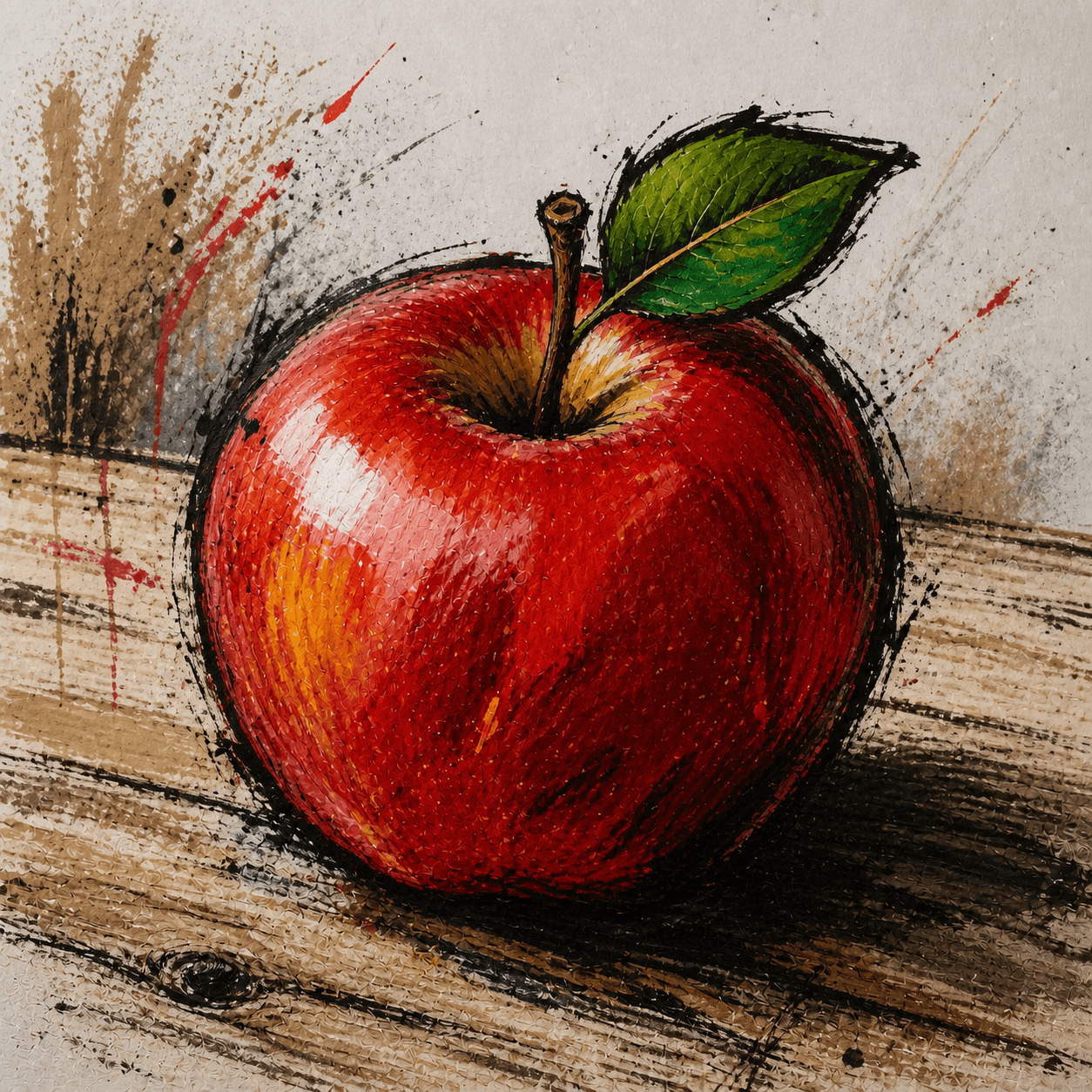
Rough line and splatter create a street tone, but not a complete graffiti work
Repeated black contour surrounds the apple while red and black spray escape the subject. Yet writing culture usually centres a name and develops speed or complexity in response to place, time, and risk.
- 01
Keep speed in the line
Contour repeats, breaks, and overshoots as if an arm moved quickly over a rough wall.
- 02
Read splatter as action
Red and black marks do not merely model volume; they bring making to the foreground.
- 03
Compete through contrast
Black outline holds against red fruit and pale wall for quick distance recognition.
- 04
Notice the absent letter system
There is no tag, letter structure, or name competition: this is an illustration using graffiti texture.
In one sentence
Write a name across shared urban surfaces—
compete through speed, placement, and letter memory
Modern graffiti writing is a name- and letter-based culture developed across authorised and unauthorised public space. A tag is a rapid signature, a throw-up expands area with bubble letters, and a piece pursues complex form, colour, and characters. It overlaps with street art but is not identical: graffiti often centres name, crew, repetition, and peer recognition, while street art may privilege image, stencil, or public address.
VISUAL LANGUAGE
Writing DNA
Name
Repeated, recognisable
Letter
Distorted, structural
Arrows, joins, outlines, and internal bones form an individual style.Speed
Site-dependent
Short exposure favours economy; legal walls permit elaborate pieces.Scale
Made for distance
Heavy outline, contrast, and broad shape answer trains and urban sightlines.Surface
Specific, contested
Wall texture, transit routes, ownership, and removal all enter meaning.Where it came from
Names travelled through transit; letter competition transformed signatures into a visual culture
People have written on walls for millennia, but contemporary graffiti writing formed in US cities in the late 1960s and 1970s. Young writers used street and subway networks to move names across neighbourhoods, developing crews, style lineages, photographic archives, and global networks.
Urban naming spreads
Writers in Philadelphia, New York, and elsewhere repeat names and street numbers, building fame through quantity and placement.
Tag becomes style writing
Subways act as moving canvases; throw-ups, pieces, characters, and whole cars intensify letter competition.
Documentation, suppression, gallery crossover
Removal campaigns grow; photography, film, and exhibitions preserve work as some writers move to canvas and international markets.
Global localisation
Graffiti and hip-hop travel, meeting local scripts, politics, legal walls, and networked images in new urban grammars.
ARTISTS & WORKS
Meet it through four writers
TAKI 183
Repeated nickname and street number across New York, becoming a symbol of early citywide tagging.DONDI
Sets a standard for New York pieces through disciplined letter structure, whole-car composition, and clarity.Lady Pink
Builds large lettering and figure worlds within a male-dominated subway culture, connecting women's experience.Futura 2000
Extends spray line, haze, and abstract motion beyond conventional lettering into performance and canvas.How to recognise it
Read name and site before aerosol appearance
- ✓Is there a repeatable name, letter skeleton, or crew identity?
- ✓Does complexity match the time, location, and risk of making?
- ✓Do outline, fill, keyline, highlight, and character form a hierarchy?
- ✓How does the work answer wall, train, community, and the chance of covering or removal?
STYLE RELATIONS
Three urban image relations
Graffiti
Centres name, letter style, repetition, site, and peer reputation.CURRENTNeo-Expressionism
Restores forceful painting through rough gesture, signs, and historical quotation within the canvas system.↗Line Illustration
Completes an image through selective line and space without urban naming culture.↗REFERENCES
Sources & image note
The apple is a contemporary commercial-style interpretation borrowing splatter, rough contour, and wall texture without letter-based naming. It supports analysis of visual borrowing, not a substitute for graffiti culture itself.