
Printmaking
Halftone
Halftone is not a separate print family. It translates continuous value into discrete dots: from a distance they appear tonal; close up only varied size, density, or frequency remains.
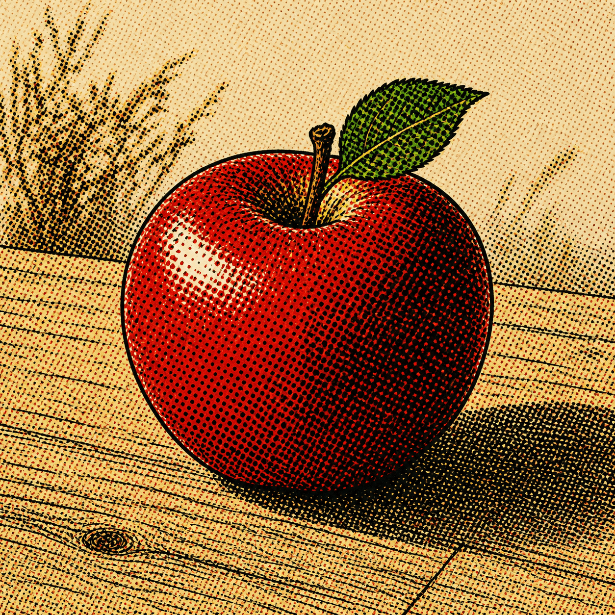
READ THE IMAGE
The apple has no continuous shadow; the eye averages enlarging black dots over red
Dots shrink or vanish in light and expand or join in the dark flank and shadow. Green and black jointly model the leaf. Move back and discrete structure returns to continuous-looking illumination.
- 01
See dots near, form far
At close range the grid is explicit; distance makes vision average it into value.
- 02
Change area, not ink darkness
Traditional amplitude modulation keeps spacing and alters printed dot coverage.
- 03
Rotate screens to manage moiré
Colour separations use distinct angles; poor interaction produces unwanted waves.
- 04
Turn infrastructure into style
Deliberately enlarged dots transform an invisible reproductive device into comics, poster, and Pop language.
In one sentence
Translate unprintable continuous shade—
into proportions of dot and empty paper a press can reproduce
Most presses either deposit ink at a location or do not. Halftone samples a photograph or gradient on a screen: small dots cover little area in light, larger dots cover more in dark, and paper plus ink mix optically at viewing distance. Colour reproduction separates channels such as CMYK and prints their screens at different angles.
VISUAL LANGUAGE
Screen DNA
Dot
Discrete, measurable
Distance
Viewing completes the image
Finer dots and greater distance encourage smooth visual fusion.Ruling
Resolution negotiates material
Higher lines per inch refine detail but demand better paper, plate, and registration.Angle
Colour screens separate
Chosen rotations limit interference and often create a rosette.Error
Moiré and misregister
Rescreening or angle conflict makes waves; shifted colour plates create fringes.Where it came from
After photography, printers needed a way for text presses to reproduce continuous light and shade
Photography arrived in 1839, but its continuous tones resisted ordinary publication. In the late nineteenth century photographic plate-making and screens broke images into dots that could print with type. Commercialised in the 1880s, halftone became infrastructure for newspapers and magazines.
Photography creates a reproduction problem
Photographs carry continuous value while relief presses favour definite ink or blank.
Screens and photomechanics mature
Optical screens convert photographs into printable dots; commercial use spreads in the 1880s.
Colour separation powers mass media
CMYK angles, improved plates, and fast presses bring photographs into news, magazines, ads, and packages.
Reproduction becomes visible style
Lichtenstein and Pop enlarge dots deliberately; digital RIPs add stochastic and hybrid screening.
ARTISTS & WORKS
Meet it through four figures and practices
Frederic E. Ives
Advances commercially usable photomechanical halftone so photographs and type can share a press run.Gustav Klucis
Combines screened photograph, red-black planes, and photomontage so reproductive technology drives political impact.Roy Lichtenstein
Enlarges commercial comic dots, turning anonymous reproduction into both painting subject and handmade paradox.Carin Goldberg
Uses screening, ink, and photographic fragments rhythmically in book design, making print structure part of reading.How to recognise it
Test whether dots actually carry tone rather than decorate the image
- ✓Do dot size or frequency correspond continuously to light and dark?
- ✓Do dots follow a stable grid and angle when magnified?
- ✓Can colour regions be separated into screen angles, overlaps, and possible fringes?
- ✓When reduced or viewed farther away, does the screen fuse into legible volume and imagery?
STYLE RELATIONS
Three dot-and-layer systems
REFERENCES
Sources & image note
The apple deliberately enlarges black dots so reproductive structure normally hidden at viewing distance becomes the subject. Actual size, shape, angle, and ruling vary across newsprint, offset, screenprint, and digital stencil output.