
Painting Media
Pen Line Art
Pen line art turns nearly irreversible ink into structure: contour states boundary, weight orders depth, hatch density translates value, and reserve makes paper carry light. It is not a photo with outlines added, but a recoding of the world through finite black and white.
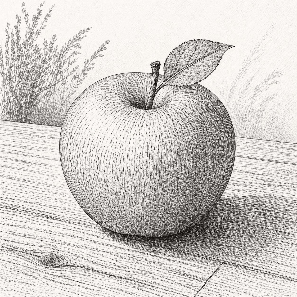
READ THE IMAGE
There is no grey pigment in the apple: every middle value is the white paper left between black lines
The lit side uses sparse broken marks, curved hatch closes through the turn, a second direction enters the core shadow, and flatter denser lines seat the fruit on the table. Contour strengthens at the near overlap and relaxes along light.
- 01
Let contour weight order space
Near and occluding edges strengthen while the lit rim thins or breaks instead of receiving one uniform outline.
- 02
Let hatch follow volume
Arcs wrap the apple and spacing closes with value rather than imposing an unrelated mesh.
- 03
Let crossed layers stage greys
Second and third directions enter only darker zones, increasing black while preserving paper light.
- 04
Let dot and dash distinguish matter
Skin fleck, leaf vein, and wood grain use distinct scales and rhythms rather than one common texture.
In one sentence
Turn flowing ink into directional black through a nib—
then organise form, light, and space with weight, density, and reserve
Pen line art is older and broader than the modern fountain pen. Reed, quill, and flexible steel nib change width with pressure, angle, and ink load; a technical pen exchanges modulation for a fixed tube. Ink may suspend carbon particles or use dye and iron-gall chemistry. Low viscosity supports flow, but feathering, lightfastness, water resistance, and acidity depend on the exact ink, sizing, and paper.
VISUAL LANGUAGE
Black-line and white-paper DNA
Weight
Width makes hierarchy
Direction
Gesture explains surface
Form lines describe volume, horizontals and verticals stabilise space, and abrupt change signals plane or matter.Density
Spacing replaces grey paint
Parallel and crossed layers progressively darken; angle and count jointly create aggregate tone.White
Reserve is not absence
Light, air, reflection, and visual pause belong to untouched support and must be designed with black.Commit
Irreversibility forces selection
A pale pencil plan is possible, but stray lines can become structure; repeated tracing usually stiffens form.Where it came from
From reed and quill to steel nib and technical pen, line moved among writing, drawing, print translation, and engineered precision
Water-based ink and pen writing cross ancient cultures. Medieval and Renaissance Europe used quill, iron gall, and brown inks for manuscript, study, and transfer; Dürer and peers made drawing hatch converse with printmaking. Nineteenth-century steel nib manufacture and twentieth-century technical drawing, comics, and reproduction pushed line toward standards and mass circulation.
Writing and image share pen and ink
Reed, brush, and quill carry carbon or plant- and mineral-derived liquids to papyrus, parchment, and paper.
Renaissance drawing converses with print
Contour, parallel and crossed line, and wash serve observation, workshop transfer, and collecting.
Steel nib and fountain pen industrialise
Flexible steel expands modulation, self-feeding pens improve portability, and synthetic dyes add colour with fading risks.
Technical, comic, and digital line coexist
Fixed tubes support engineering and reproduction; original comics, scientific illustration, and current hand drawing retain committed judgment.
ARTISTS & WORKS
Meet it through four makers
Albrecht Dürer
Brings print-like parallel and cross-hatching into paper study so line describes texture and constructs light.Rembrandt
Switches among reed, quill, and brown ink in heavy stroke, dry break, and quick turn, making few lines hold space.Aubrey Beardsley
Uses solid black, attenuated contour, and fierce reserve for decorative tension designed to reproduce in print.Moebius
Builds science-fiction worlds with lucid contour, sparse shade, and exact environments, proving space need not depend on tonal rendering.How to recognise it
Ask first whether line performs structure, then whether black-white is designed for paper and reproduction—not merely uniform tracing
- ✓Does contour weight change with light, overlap, distance, and focus?
- ✓Does hatch follow form and density establish a readable value ladder?
- ✓Does reserve actively organise light and air rather than look unfinished?
- ✓Do feather, ink pool, dry break, and nib turn agree with tool and support?
STYLE RELATIONS
Three line-centred images
Pen Line Art
Liquid ink is generally irreversible and builds black-white through weight, hatch, and reserve.CURRENTGraphite Sketch
Erasable, blendable, and silvery reflective, with a more continuous tonal range.↗Etching
A needle opens a resist, acid bites a plate, and pressure transfers ink to multiple sheets.↗REFERENCES
Sources & image note
The apple is a contemporary pen-line teaching interpretation emphasising weighted contour, form hatch, selective crossing, stipple, and active reserve. A screen cannot reproduce nib drag, pooled edges, or fine ink travel through paper fibre.